We anticipate the ways in which brands & people

We are a digital design studio in Christchurch, New Zealand, focused on creating innovative websites and branding.
For over 15 years now we’ve been working with startups to well established companies, helping them discover their essence. We design to make your business grow, through cutting-edge functional and beautiful websites. We’re a full service digital agency for all your marketing and online needs.
branding
Better businesses by creating joyful digital ideas
Graphic Design
If it can be printed on, we can design for it. Business cards, marketing material, adverts...
WEBSITE DESIGN
Brochure websites, self-managed websites, eCommerce/ shops to responsive websites, whatever you require we are experts at transforming your vision into a beautiful website.
Hosting
Ultrafast local New Zealand servers and a 99.9% uptime.
Recent Work
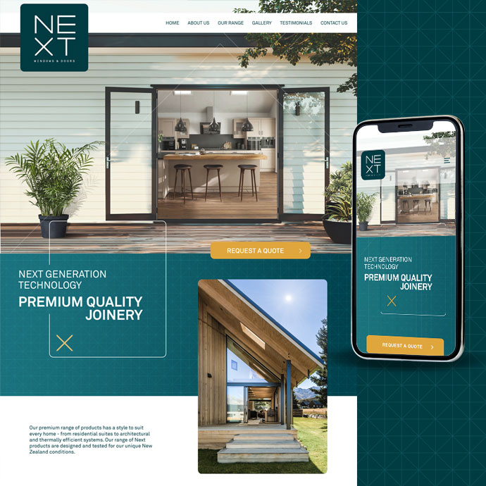
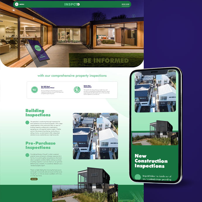
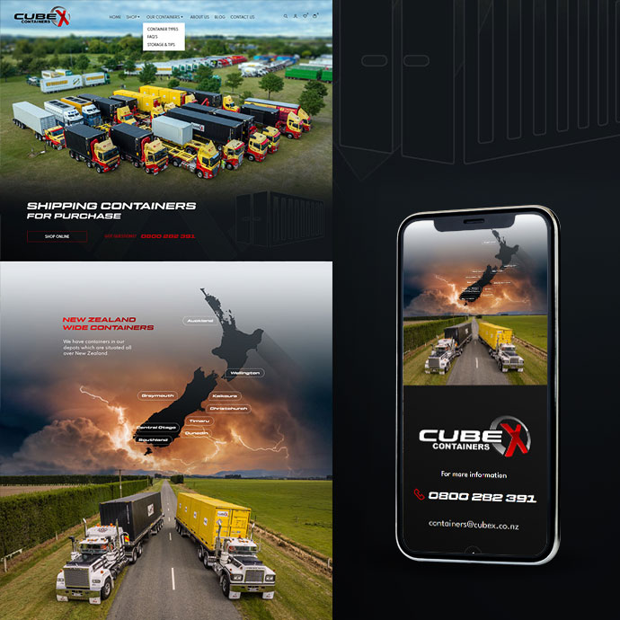
Website
Design
A that gets results
Using a combination of jaw dropping web design, a ton of great content and a focus on conversion, our sites are engineered to get results. Because at the end of the day, results are all that matter.
- Web design
- Content creation
- Mobile/Responsive Design
- Web Development
- eCommerce/Shopping
- Content Management Systems
Branding
and Logos
Get all attention you deserve
Not only do we design great looking, award winning, high performing websites, we also love designing you the perfect logo and branding packs that you can take forth and conquer!
Give your brand a personality, make it recognisable, connect with your audience. We help you take control of how you are represented and accurately reflect the quality of the service or product you provide.

Graphic Design
We offer a complete in-house design service; from logo creation, business cards and stationary, through to newsletters, brochures and magazines layouts. If it can be printed on, we can design for it.
- Logos and Branding
- Business Cards
- Stationery & Letterheads
- Adverts
- Flyers & Brochures
- Signage Design
Hosting
Get your online
If you need someone to take care of your online presence, we can help. From setting up your domain, managing your hosting and emails, you can leave it all to us. Ultrafast local New Zealand servers and a 99.9% uptime – sign up with us today!
- Ultrafast NZ/Local Servers
- SSD (Sold State Drives)
- Free Backups
- 7 Day Support

Brands
we have been fortunate enough to work with over the years


Take your business further
Let's create great things together